Development tools for responsive web design are getting better all the time. Unfortunately they are not always obvious. Recently one of my co-workers showed me how Google Chrome has a great tool for showing how a web page responds to changing view port sizes. Well I personally prefer developing in Firefox, so I went looking for a plug in that does the same, and was surprised to find out that Firefox natively does the same thing. IE also has, although more primitively, the ability to show different view port sizes.
So here is how you get to each tool.
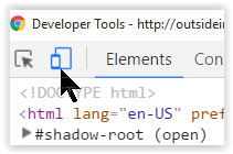
Responsive tools in Chrome
In Chrome, press F12 to bring up the developer tools and then click the responsive icon:
In the browser window the page will now be displayed with drag handles:
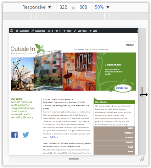
Supposedly you should be able to also press Ctrl-Shift-M but on my system that is mapped to something else.
You also have presets that you can select.
Responsive tools in Firefox
In Firefox you press Ctrl-Shift-M and in the browser window you get something very similar:
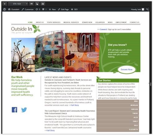
The same type of drag handles and presets appear in Firefox as in Chrome. You also get a snapshot icon to save the view as an image.
Responsive tools in IE
Finally, IE also has the ability to change view port sizes, but not dynamically with drag handles. In IE, you launch the developer tools (F12) and go to the emulation tab:
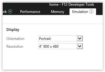
There you have a “Resolution” drop down and an “Orientation” drop down so you can emulate different screen resolutions and orientations.
Conclusion
Responsive design is important, and tools built into the browsers make designing responsive web sites easier, without having to rely on third party tools and add-ons. Try these and see what I mean.