How do you learn about usability? Learning about usability can be accomplished by reading textbooks on the subject, or by reading internet articles. But it can also be learned by looking at and examining examples of bad usability. A good source of examples is from Jakob Nielsen’s web site on user experience. But perhaps the best source is to conciously recognize bad usability when you see it.
I recently had an experience with bad user design that I thought I would share with you. The culprit was a premium WordPress theme, which goes to show that paying for something doesn’t always mean that you get a good product. In this case a lot of the product is good, but the issue with bad user experience and usability is that it doesn’t take much to turn off a user from your product or web site.
So here is an example of bad usability
The first issue I had was a long list of modules that could be customized. Below is a portion of the list. There are about 30 items in the list.
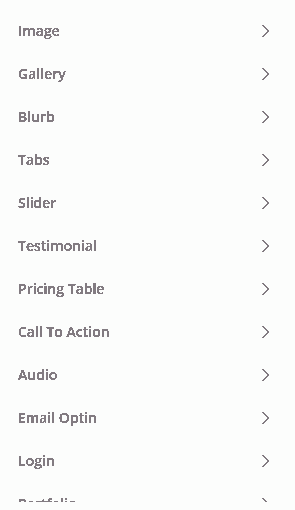
The issue is that long lists should be sorted alphabetically, or at least have an option to sort the list. I guess the developer might have thought that the list is in order of likely use, but one person’s order of use is likely to be different from another.
The next issue was in another section used to turn on and off roles you are shown groups of slider buttons:
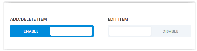
Here the words “enable” and “disable” are not used properly. They are verbs that would indicate that you should click them to enable or disable the setting. But that is not what they mean here. In this case you click “enable” to disable the feature.
A better design would have used the words “enabled” and “disabled” to indicate the current state (which is what the colors indicate, bright colors typically mean on, and grey colors mean off).
The experience is important.
And then the last issue (before I screamed and decided to write this post) was with the “save” button, to save the changes I had made. The button was nicely designed and obvious; located at the upper left of the screen.
Unfortunately the indication that I had clicked on the button was a small circle far away from the button in the center of the screen, showing an animated “in progress” wheel.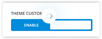
It animated for less that a second then changed to a small green circle with a check in it,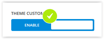
which faded away in less that a second. My attention was on the button I had just clicked on so I didn’t notice the little circle. A better solution would have been to locate the circle to the right of the button that I clicked, or perhaps even better would have been to resist the urge for a cute animation and just added a message next to the button saying “Your changes have been saved.”
There were other issues (don’t get me started on designs that have light grey text on a white background) but you get the idea.
Usability is critical
Users will not tolerate slow, ugly websites that are difficult to navigate and find information they are looking for. They will not tolerate sites that put up roadblocks preventing them from accomplishing the tasks they want to accomplish. If you are designing a web site, you need to keep user experience and usability as the guiding design principles.