Background
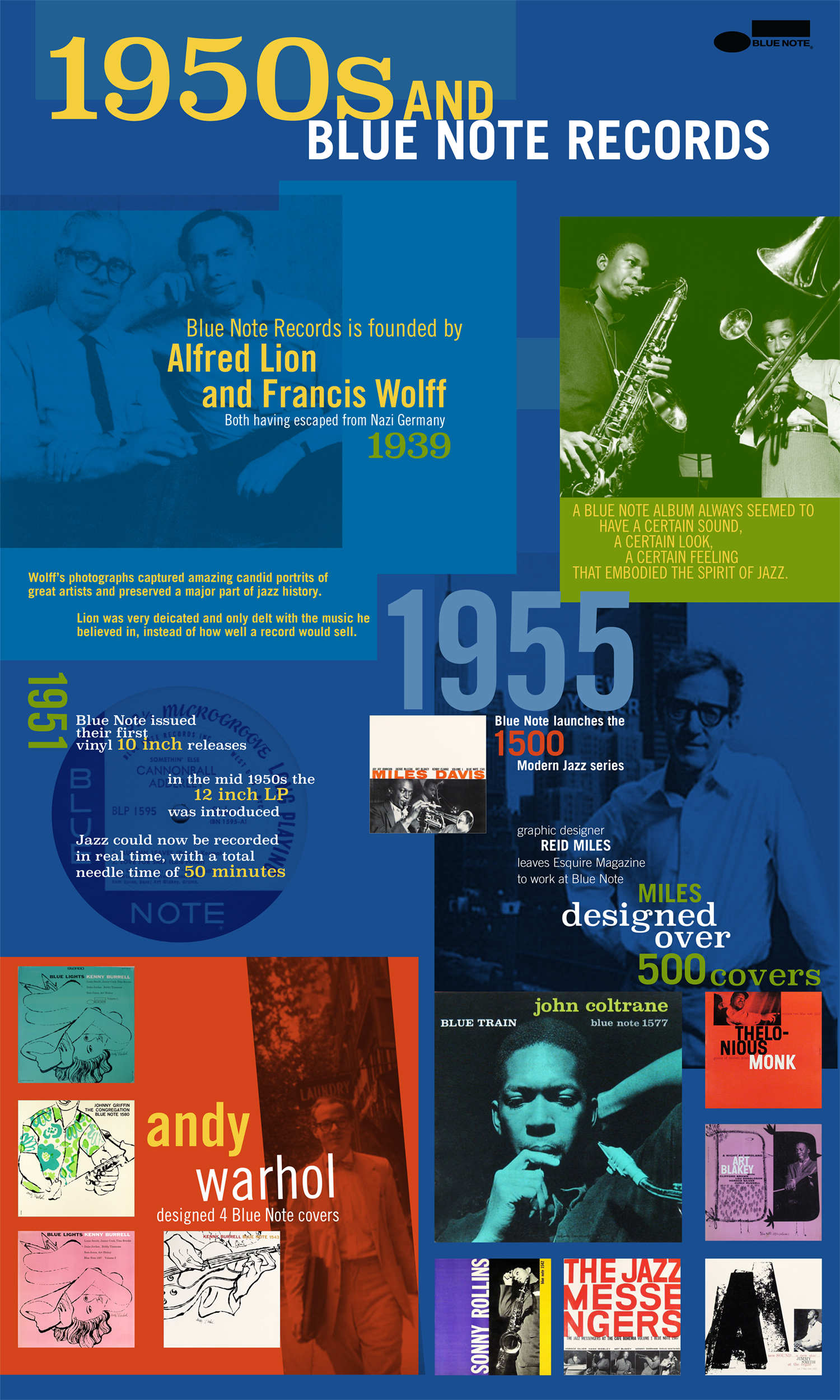
I have a love of jazz and Blue Note Records album cover artwork. The 1950s were the heyday for jazz and Blue Note Records; and the graphic design of their album covers always had a certain look that embodied the spirit of jazz.
I enjoy listening to and collecting vinyl. It’s incredible that records that are over 60 years old still sound amazing today. I like that there are two forms of art to enjoy at the same time; the album cover and the music.
Content
Blue Note album cover graphic designer Reid Miles was the primary inspiration for my poster. In 1955 Miles left Esquire magazine to join Blue Note, and in turn created some of the most well known album covers of the Blue Note era. Miles was influenced by modern Swiss design and Bauhaus/German modernism and created over 500 covers for Blue Note.
Design Style
Mirroring modernist design style, I used typography as a visual element rather than just explanation or information about the era. This is representative of the fonts and techniques Miles would have used on his album artwork.
I wanted the colors I chose to reflect the emotions of jazz and I used duotone photos with bold colors to note the cool, modern, and progressive “jazz mood” of the time.[cf “poster-image”]
