Background
The 70s… a period of time that most people associate with “interesting” color palettes, disco, feathered hair, and a departure from the settled times of the past. Being a designer born in the beginning of the 1970s, 1972 specifically, I grew up not really aware of much of the time period. Though there are cliche reminders of the 70s, I thought it would be interesting to focus on what was real at the time and how it was remembered by those who focus on details.
Content
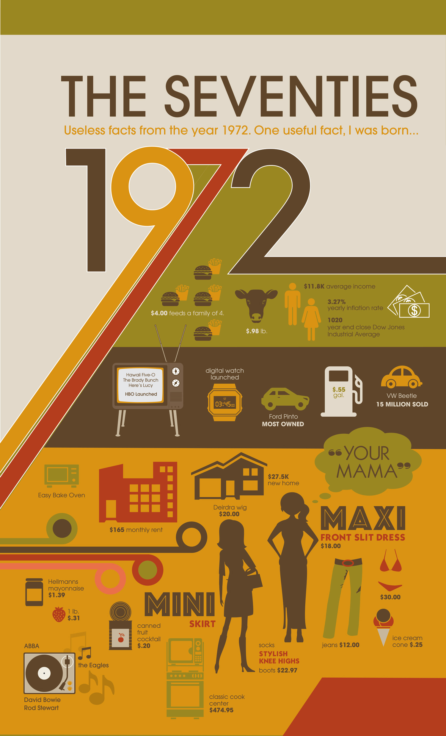
I decided to take a look back into 1972 to see what was top in design, hoping to find inspiration. But in doing research, I found that the 70s was a time where designers wanted to break away from the constraints of Swiss International and started the Post-Modernism movement. The punk uprising opened doors to a sort of DIY design, using what was practical. With design in transition and flux, I chose to take what was noticeable from the 70s typography, color, bold use of lines, and create an infographic based on useless facts about 1972. Those of us over 40 years in age will find it hilarious to see products that we use in everyday life and how much they cost back then. Those under 30 will probably wonder what some of these things are. None the less, it’s pretty funny to see the comparison to how life is now.
Design Style
My poster design style is influenced by Post-Modernism. Color and grid were main components to start. Color use within this design is a major influence of identity for the time period. The typography chosen was based on trending typefaces, however selected based on what was not entirely hideous (because some really were). Since I was doing a comparison of information to current times, I felt the use of some simple, iconic artwork would allow for easy recognition.
[cf “poster-image”]

Fairly! This was a truly excellent post. Thank you for your provided information