Background
As a child, the first things to make me aware of design were the monster magazines that were enjoying the end of their heyday. The boldly painted covers and wildly creative typography drew my eye and inspired me to start drawing my own letterforms.
In those pre-internet days, a highlight of our trips to Seattle was the opportunity to visit theaters that regularly showed older films. Monster films from the past were always a favorite. The chance to see the creatively drawn and animated titles on the big screen, and old-style movie posters was a true treat.
Content
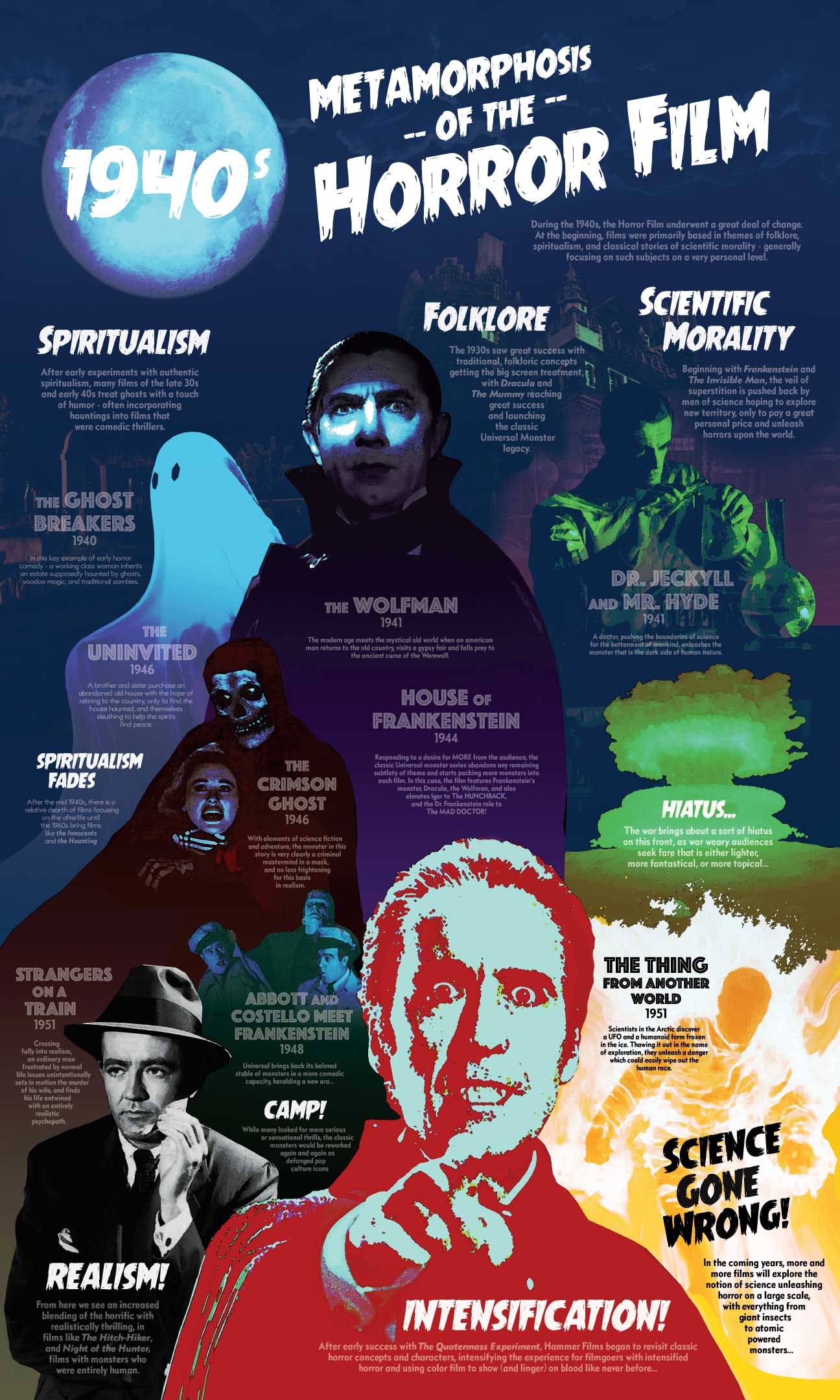
As we were selecting content for our poster series, I was inspired to try and capture the shift of visual styles in the advertising for these films which occurred over the 1940s.
Reviewing the posters and lobby cards from the era I would be working with, I noticed some clear trends with the content of horror films as well as the visual styling. In broad terms, American audiences responded to the ongoing conflict in Europe by wanting either significantly less or more horror in their horror films, and complex, high-budget films all but disappeared simply as a result of wartime economics.
By the end of the decade, many were exhausted by the real life horrors of war, and instead sought escape with lighter fare. But those still seeking the thrill of monsters onscreen were looking for new and more intense sensations.
Science related horror all but disappeared from the silver screen in the mid-40s. Upon its return, the films underwent a significant shift in focus. The thrillers of the 1930s and early 40s had primarily focused on scientific exploration on a personal, almost Faustian level. But by the end of the 1940s, with the world in awe and fear of atomic power, the dangers unleashed by cinematic mad science tended to threaten humanity on a much larger scale.
Design style
During the 40s, there was a clear shift in visual style for the posters advertising these films.
In the 1930s, the trend in poster design was towards softer, muted palates—sometimes with a pop color—evoking the moody and mysterious tones of the films. By the 1950s, the trend had moved towards more graphic styles, higher contrast, and intense images—again mirroring the increased shock factor of the subject matter.
My intention was to show the transition between those styles from top to bottom, the colors shifting from softer blues to bright reds, and the graphic styling going from soft to bold. The overall shift in tone and subject matter cannot be better represented than in the contrast between Bela Lugosi’s mysterious stare from the shadows at the top of the poster, to the intensity of Christopher Lee’s fanged visage at the bottom.[cf “poster-image”]
